Hermanos Brewing Co.
THE CLIENT
Hermanos is a beer brand that has been brewed in Austin, Texas and just entered the market.
THE KEYWORDS
Classic / Modern / Energetic / Soft
THE SOLUTION
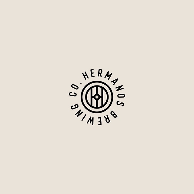
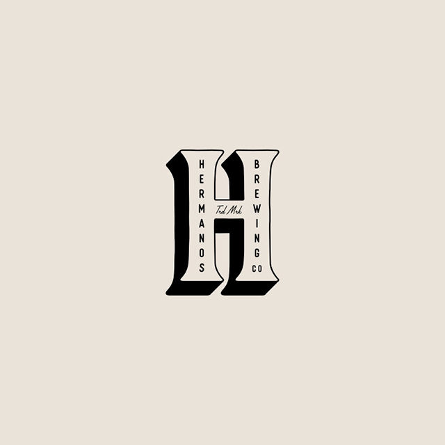
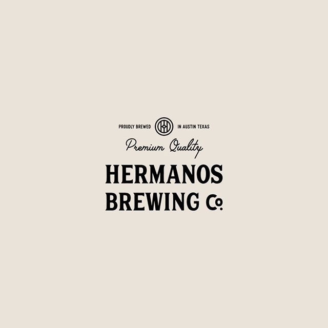
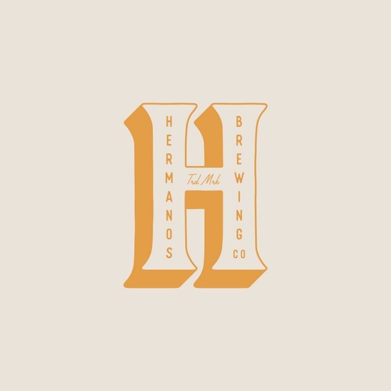
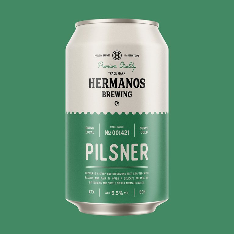
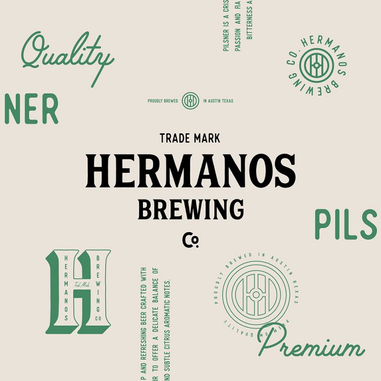
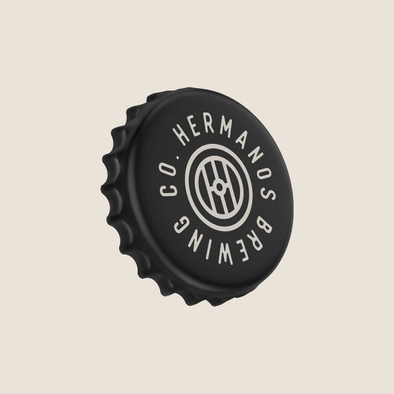
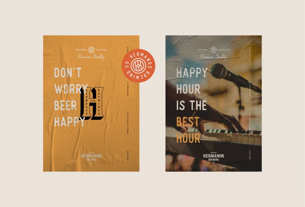
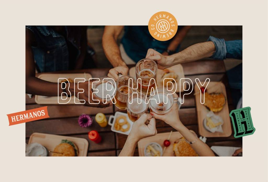
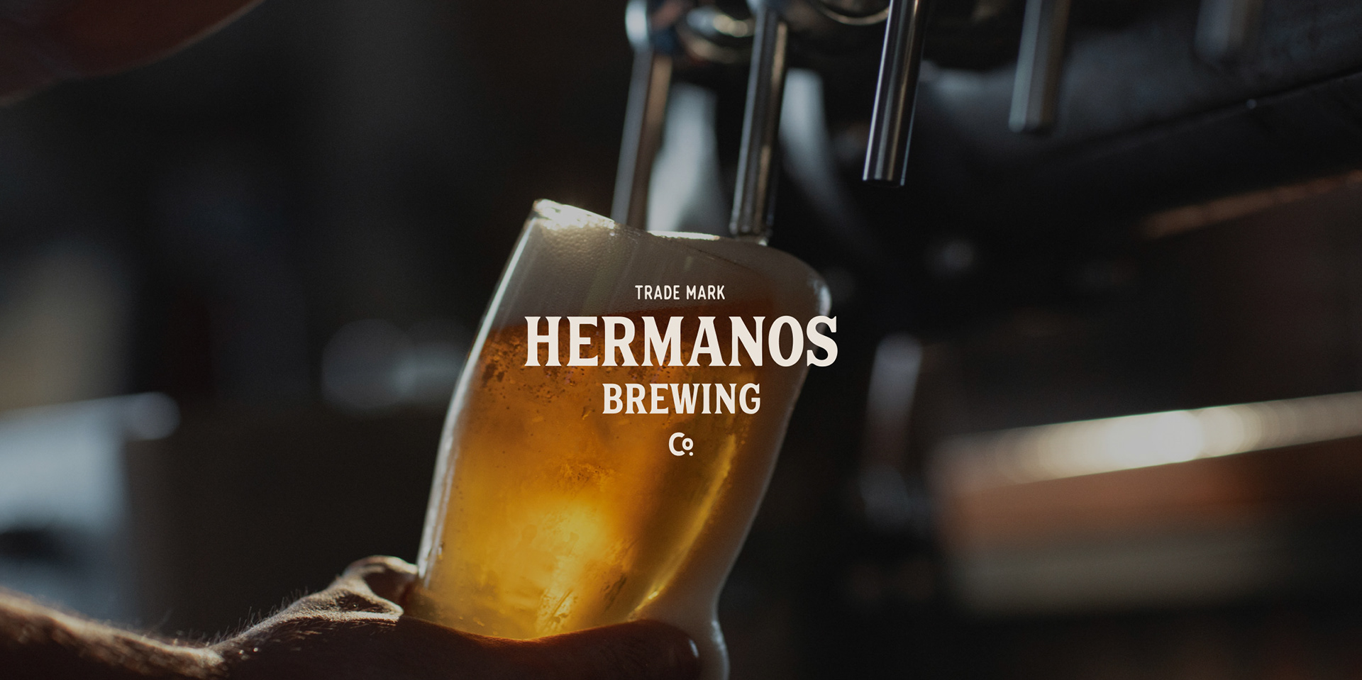
For the logo we have thought of the classic and bold typography with the highlight band and unique point at the “Co”, where the “o” looks like a degree sign. This way, it gives an understanding of the product’s type. At the same time, we designed an abstract mark and emblem that are memorable and associative with the brand’s identity and can also be printed on t-shirts and other products.
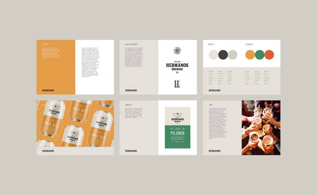
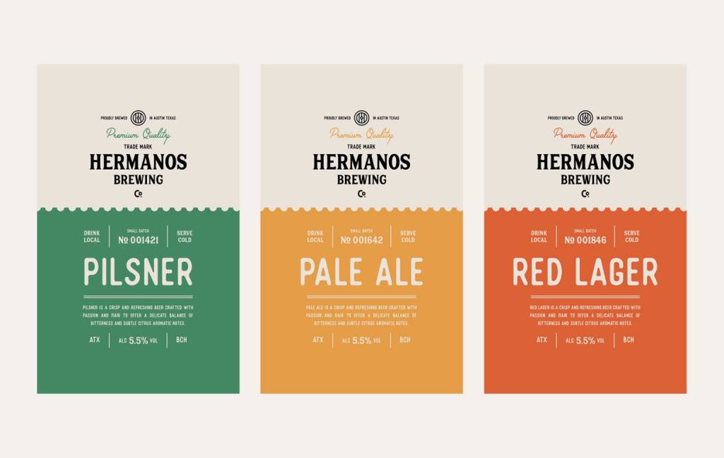
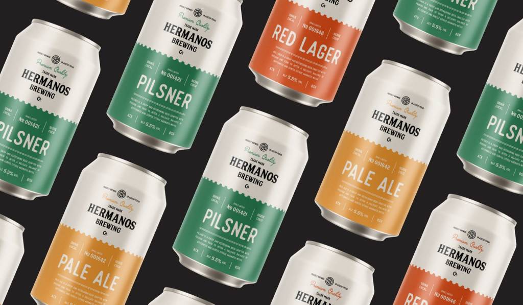
The colours we selected are divided into two different spectres. The first is neutral shades of grey and black, and the second is a set of soft and vibrant colours. Each vibrant colour was set for a specific brewing type.
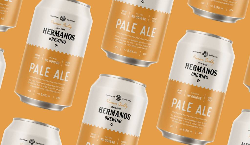
We applied a two-tone design combining serif and sans serif fonts to the product to create a modern look while maintaining its classic image. For the light grey color, we applied the logo, emblem, and the “Premium Quality” sentence. For the coloured part, we included the information about each brewing type with its taste description. As it was required, we stated the alcohol percentage right at the bottom centre part with an enlarged and bold font.
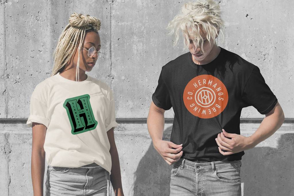
We have also given the emblem and abstract mark the 3D typeface treatment, allowing them to pop off t-shirts and other products. For a professional product presentation, we included 3D product designs.